

Same us. New look.


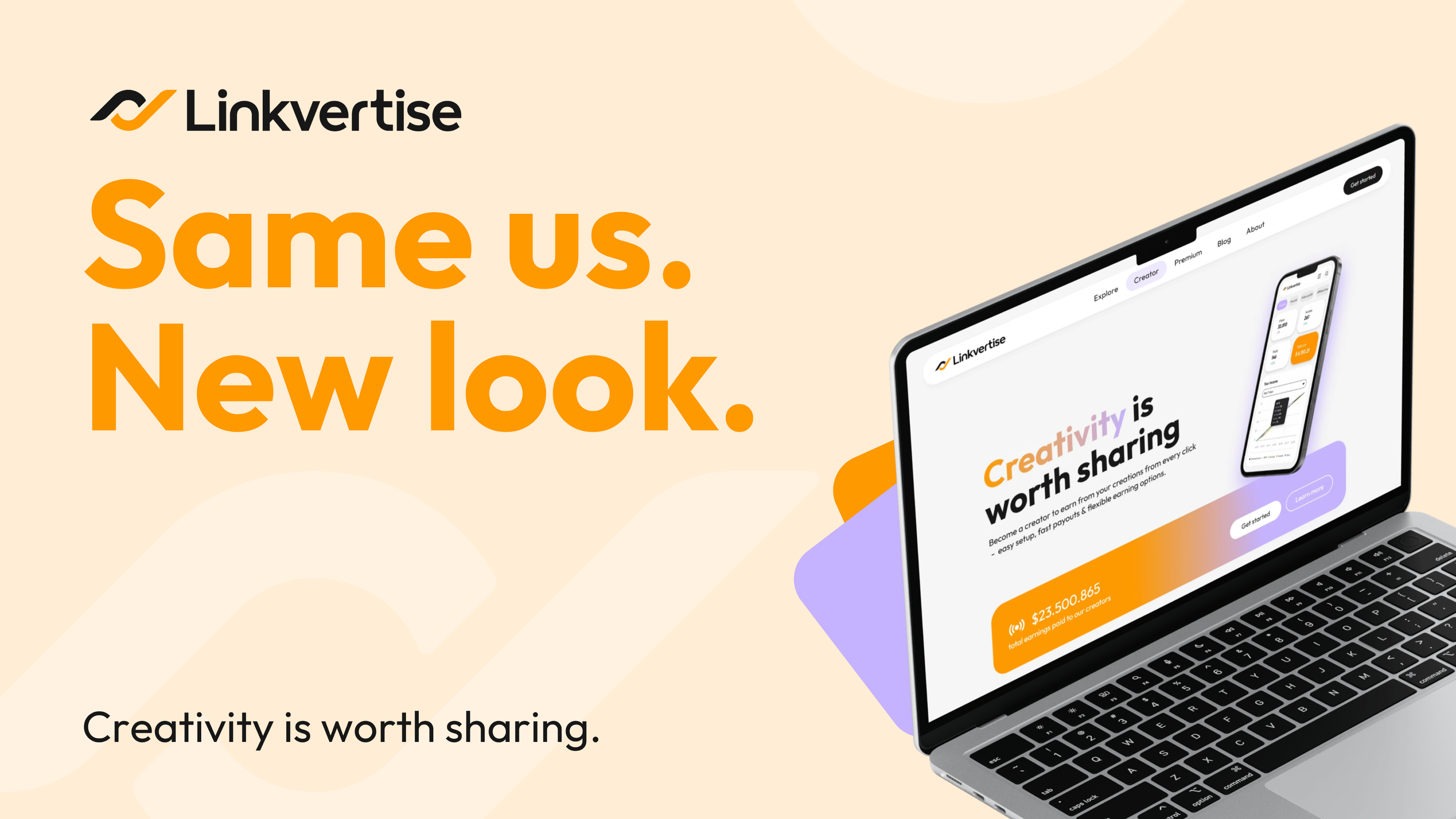
Hello, nice to meet you - it’s a new-look Linkvertise!
You might have noticed: Things look a bit different now. We’ve spend some time, love and energy to create a fresh look to our brand - from our logo to our website. Not just letters or colors on a paper sheet, it was also about defining who we are and what we stand for as a brand.
There have been lots of late-night sessions and creative discussions, but it’s finally here. Dive in and explore how we revamped the Linkvertise brand to inspire people to create, share and earn from what they love, discovering new passions and empower everybody to embrace the beauty of creativity.
Becauce creativity is worth sharing.
The story behind our rebrand
At Linkvertise, digital creations come to life. We know how much dedication, heart and passion exists throughout our always-evolving community of creators and their fans.
Whether you’re a creator looking to inspire others and earn from what you love, or someone exploring new things and discovering new favorites, we wanted our brand to have more expression and depth to better reflect what matters most: YOU.
Created entirely by our own team - not some anonymous agency or outside consultants - ideas were sketched, brainstorming sessions were held, and lots of “almost there” moments turned into “back to the drawing board.” But while grinding through discussions and feedback loops, our brand’s identity was evolving. And now it’s finally here.
Our identity
The beauty of creativity lies in it’s foundation: The love, the passion for creating new things and the excitement it sparks. The little butterflies in your stomach you feel when an idea comes to life. Or the relief when you finally find something you’ve been looking for for so long.
We wanted to celebrate the connection between creators and their fans in a much more meaningful way. Our brand should reflect what drives our community every day:
Creativity, inspiration and the recognition it deserves. Pushing boundaries and bringing ideas to life. Therefore, our goal was to create a world where everyone can thrive - blending visionary creativity with practical, down-to-earth accessibility.
Our new logo
We want our community’s work to shine. But to do so, we had to start with…US.
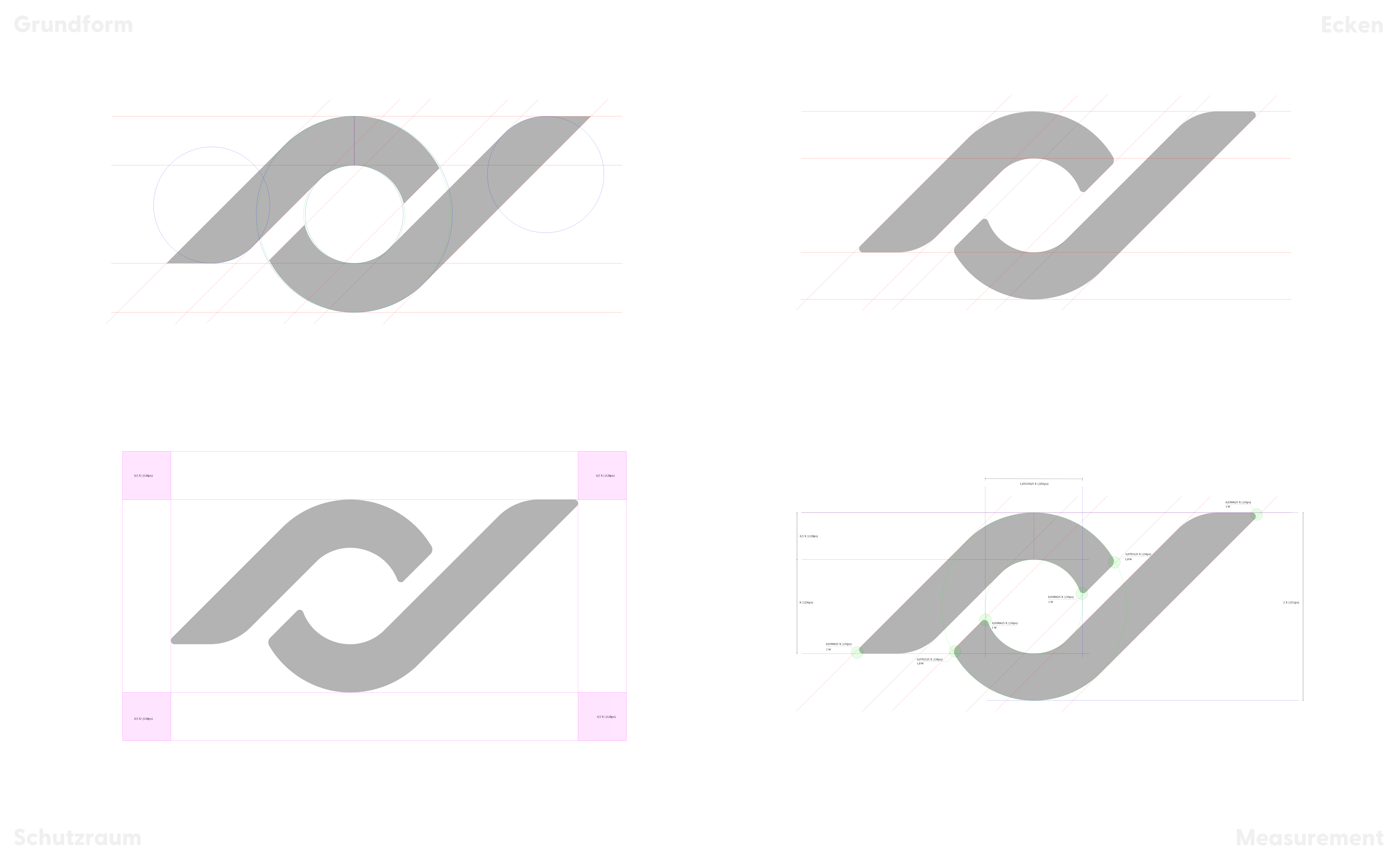
Inspired by our original logo when the company first launched, our goal was to create something simple while at the same time dynamic to symbolize our community’s energy and passion. But finding a design that felt current yet timeless wasn’t an easy task - it was a process.
It wasn’t just about scetching some ideas - it was also about finding who we really are and what we stand for:
Empower everybody to turn their creativity into something bigger, to connect people and to make an impact.
Paying homage to our old logo reminds us where we came from while capturing Linkvertise’s core vision. Countless drafts and sessions later - because sometimes, you just can’t see the forest for the trees - we came up with our new logo to capture this feeling of connection, drive and familiarity.
It’s simple. It’s relatable. It’s us.
It's a new vibe
It’s about being the star of the show. But that’s not us, that’s not Linkvertise - it’s our community’s creativity.
That’s why we wanted to create a brand world where creativity could thrive, without being overly flashy, too vibrant or loud. Our community’s creativity should shine and take the spotlight and Linkvertise grants the room to do it.
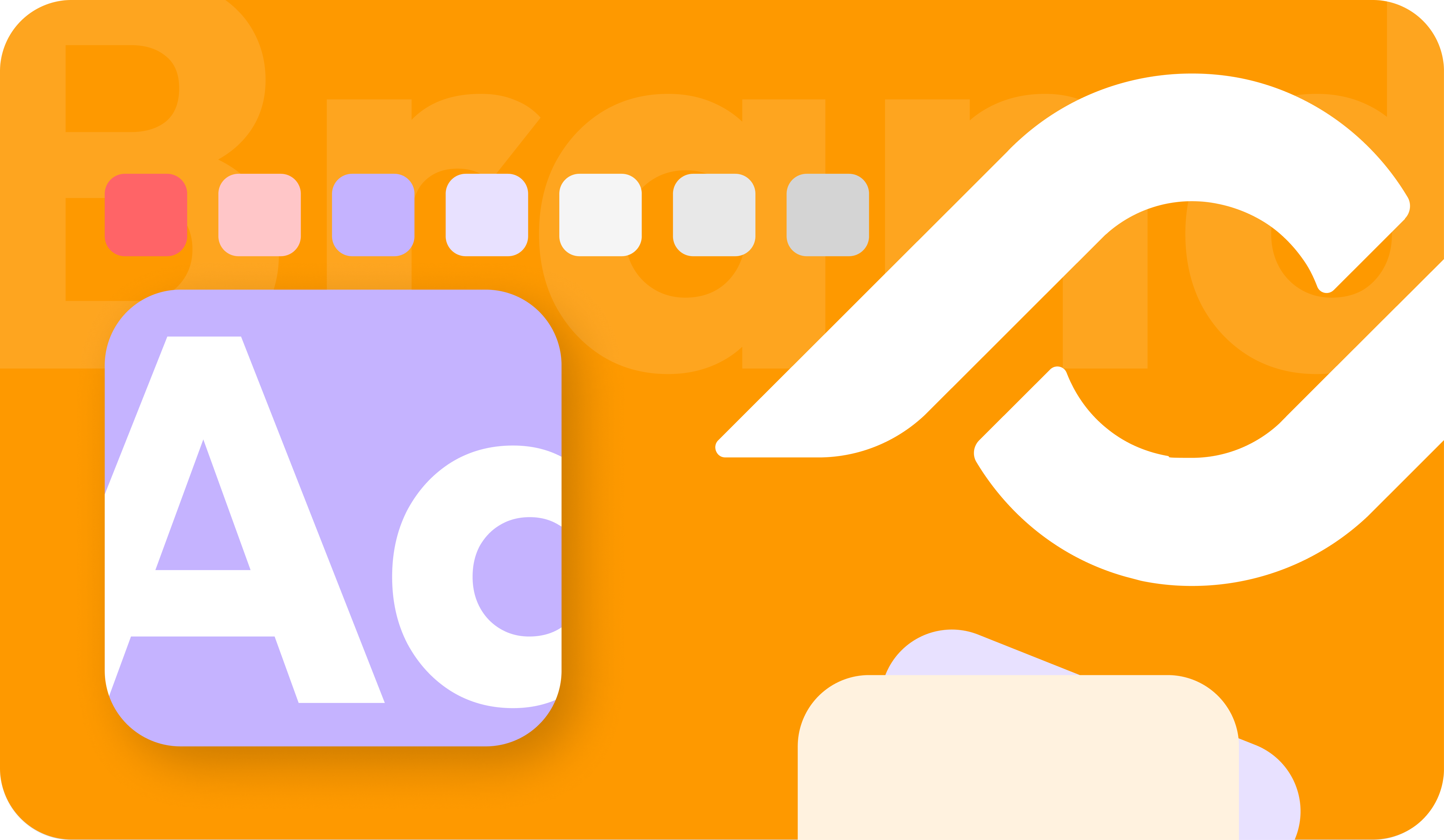
Sometimes, you have to add colors to your life. We still love our orange, but creativity was never meant to come in just one color. We wanted our color palette to be more dynamic, fresh and brighter, so we added some new shades to the family:
- LV Orange 2.0 - Our reimagined Linkvertise orange is now more bold and energetic, but still unmistakably us
- Purpely - Brings a playful twist and adds the right amount of energy to the mix
- Neutrals - Different shades of grey know when to take a step back.
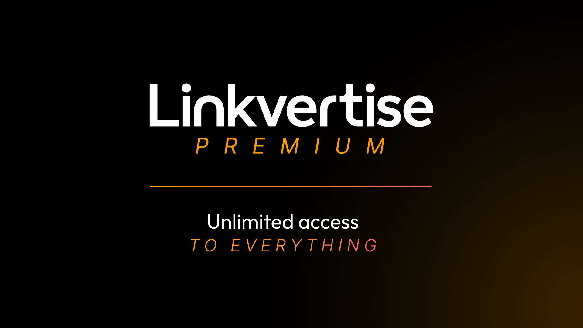
Also, PREMIUM needed it’s own look. Deep black sets the stage, while our signature orange keeps it unmistakably Linkvertise. A vibrant touch of coral adds just enough energy to make PREMIUM stand out from the crowd.
Altogether, they give us the freedom to be bold without stealing the show.
New, fresh, vivid - Our new website
New logo? Check. New colors? Check. But if we were going to give Linkvertise a fresh identity, we wanted you to actually feel it.
Here we go! We’re kickstarting the rebrand with a brand-new website that looks better, but also functions better.
We completely reimagined our landing page and refreshed the look and feel of the platform - creating a more vibrant, intuitive, and inspiring home for everything our community creates and discovers while enhancing user experience.
A rebrand shouldn’t just look different. It should feel different, right?
New look, same incredible community
Thanks to everyone who’s created, shared, discovered, and grown with us! This next chapter wouldn’t be possible without you - and we’re only getting started.


Made with

from our Social Media team
Need help?
Find quick answers to all your questions in our Helpcenter.



